Python Tutorial --- basic time series analysis


- First graph
- Two columns in the same graph
- Calculate stuff
- Two y axes
- NaN, Missing data, Outliers
- Resample
- Smoothing noisy data
- Smoothing noisy data
Import packages.
If you don't have a certain package, e.g. 'newpackage', just type
pip install newpackage
import urllib
import matplotlib.pyplot as plt
import numpy as np
import pandas as pd
import os.path
import matplotlib.dates as mdates
import datetime as dt
import matplotlib as mpl
from pandas.tseries.frequencies import to_offset
from scipy.signal import savgol_filter
This is how you download data from Thingspeak
filename1 = "test_elad.csv"
# if file is not there, go fetch it from thingspeak
if not os.path.isfile(filename1):
    # define what to download
    channels = "1690490"
    fields = "1,2,3,4,6,7"
    minutes = "30"

    # https://www.mathworks.com/help/thingspeak/readdata.html
    # format YYYY-MM-DD%20HH:NN:SS
    start = "2022-05-01%2000:00:00"
    end = "2022-05-08%2000:00:00"

    # download using Thingspeak's API
    # url = f"https://api.thingspeak.com/channels/{channels}/fields/{fields}.csv?minutes={minutes}"
    url = f"https://api.thingspeak.com/channels/{channels}/fields/{fields}.csv?start={start}&end={end}"
    data = urllib.request.urlopen(url)
    d = data.read()

    # save data to csv
    file = open(filename1, "w")
    file.write(d.decode('UTF-8'))
    file.close()
You can load the data using Pandas. Here we create a "dataframe", which is a fancy name for a table.
df = pd.read_csv(filename1)
# rename columns
df = df.rename(columns={"created_at": "timestamp",
                        "field1": "T1",
                        "field2": "RH",
                        "field3": "T2",
                        "field4": "motion_sensor",
                        "field6": "VWC",
                        "field7": "VPD",})
# set timestamp as index
df['timestamp'] = pd.to_datetime(df['timestamp'])
df = df.set_index('timestamp')
fig, ax = plt.subplots(1, figsize=(8,6))

ax.plot(df['VPD'])
# add labels and title
ax.set(xlabel = "time",
       ylabel = "VPD (kPa)",
       title = "my first graph")
# makes slanted dates
plt.gcf().autofmt_xdate()

fig, ax = plt.subplots(1, figsize=(8,6))

ax.plot(df['T1'], color="tab:blue", label="SHT Temperature")
ax.plot(df['T2'], color="tab:orange", label="DS18B20 Temperature")
# add labels and title
ax.set(xlabel = "Time",
       ylabel = "Temperature (deg C)",
       title = "two sensors",
       ylim=[20,35],
       )
# makes slanted dates
plt.gcf().autofmt_xdate()
ax.legend(loc="upper right")

def calculate_es(T):
    es = np.exp((16.78 * T - 116.9) / (T + 237.3))
    return es

def calculate_ed(es, rh):
    return es * rh / 100.0

es = calculate_es(df['T1'])
ed = calculate_ed(es, df['RH'])
df['VPD2'] = es - ed
See if what you calculated makes sense.
fig, ax = plt.subplots(1, figsize=(8,6))

ax.plot(df['VPD'], color="tab:red", label="VPD from ESP32")
ax.plot(df['VPD2'][::100], "o", color="black", label="VPD from python")
# add labels and title
ax.set(xlabel = "Time",
       ylabel = "VPD (kPa)",
       title = "VPD calculated twice",
       ylim=[0,5],
       )
# makes slanted dates
plt.gcf().autofmt_xdate()
ax.legend(loc="upper right")

fig, ax = plt.subplots(1, figsize=(8,6))

ax.plot(df['VPD'], color="tab:red", label="VPD")
plt.gcf().autofmt_xdate()
ax2 = ax.twinx()
ax2.plot(df['T1'], color="tab:cyan", label="Temperature")
ax.set(xlabel = "Time",
       title = "two y axes",
       ylim=[0,5],
       )
ax.set_ylabel('VPD (kPa)', color='tab:red')
ax.spines['left'].set_color('red')

ax2.set_ylabel('Temperature (deg C)', color='tab:cyan')

start = "2022-05-03 12:00:00"
end = "2022-05-06 00:00:00"

fig, ax = plt.subplots(1, figsize=(8,4))

# plot using pandas' plot method
df.loc[start:end, 'T2'].plot(ax=ax,
                             linestyle='-',
                             marker='o',
                             color="tab:blue",
                             label="data")

# annotate examples here:
# https://jakevdp.github.io/PythonDataScienceHandbook/04.09-text-and-annotation.html
ax.annotate("NaN",                             # text to write, if nothing, then ""
            xy=('2022-05-03 20:30:00', 25),    # (x,y coordinates for the tip of the arrow)
            xycoords='data',                   # xy as 'data' coordinates
            xytext=(-20, 60),                  # xy coordinates for the text
            textcoords='offset points',        # xytext relative to xy
            arrowprops=dict(arrowstyle="->")   # pretty arrow
           )
ax.annotate("outlier",
            xy=('2022-05-03 22:30:00', 85),
            xycoords='data',
            xytext=(40, -20),
            textcoords='offset points',
            arrowprops=dict(arrowstyle="->")
           )
ax.annotate("missing rows",
            xy=('2022-05-05 00:00:00', 25),
            xycoords='data',
            xytext=(0, 40),
            textcoords='offset points',
            arrowprops=dict(arrowstyle="->")
           )

ax.xaxis.set_major_formatter(mdates.DateFormatter('%d %b, %H:00'))
plt.gcf().autofmt_xdate()
ax.set(xlabel="",
       ylabel="Temperature (deg C)")

The arrows (annotate) work because the plot was
df['column'].plot()
If you use the usual
ax.plot(df['column'])
then you matplotlib will not understand timestamps as x-positions. In this case follow the instructions below.
start = "2022-05-03 12:00:00"
end = "2022-05-06 00:00:00"

fig, ax = plt.subplots(1, figsize=(8,4))

ax.plot(df.loc[start:end, 'T2'], linestyle='-', marker='o', color="tab:blue", label="data")

t_nan = '2022-05-03 20:30:00'
x_nan = mdates.date2num(dt.datetime.strptime(t_nan, "%Y-%m-%d %H:%M:%S"))
ax.annotate("NaN",
            xy=(x_nan, 25),
            xycoords='data',
            xytext=(-20, 60),
            textcoords='offset points',
            arrowprops=dict(arrowstyle="->")
           )
t_outlier = '2022-05-03 22:30:00'
x_outlier = mdates.date2num(dt.datetime.strptime(t_outlier, "%Y-%m-%d %H:%M:%S"))
ax.annotate("outlier",
            xy=(x_outlier, 85),
            xycoords='data',
            xytext=(40, -20),
            textcoords='offset points',
            arrowprops=dict(arrowstyle="->")
           )
t_missing = '2022-05-05 00:00:00'
x_missing = mdates.date2num(dt.datetime.strptime(t_missing, "%Y-%m-%d %H:%M:%S"))
ax.annotate("missing rows",
            xy=(x_missing, 25),
            xycoords='data',
            xytext=(0, 40),
            textcoords='offset points',
            arrowprops=dict(arrowstyle="->")
           )
# code for hours, days, etc
# https://docs.python.org/3/library/datetime.html#strftime-and-strptime-format-codes
ax.xaxis.set_major_formatter(mdates.DateFormatter('%d %b, %H:00'))
plt.gcf().autofmt_xdate()
ax.set(xlabel="",
       ylabel="Temperature (deg C)")
fig, ax = plt.subplots(1, figsize=(8,4))

delta_index = (df.index.to_series().diff() / pd.Timedelta('1 sec') ).values
ax.plot(delta_index)
ax.set(ylim=[0, 100],
       xlabel="running index",
       ylabel=r"$\Delta t$ (s)",
       title="Time difference between consecutive rows")

fig, ax = plt.subplots(1, figsize=(8,4))

# Downsample to spaced out data points. Change the number below, see what happens.
window_size = '15min'
df_resampled = (df['T2'].resample(window_size)  # resample doesn't do anything yet, just divides data into buckets
                        .mean()                 # this is where stuff happens. you can also choose "sum", "max", etc
               )
# optional, add half a window size to timestamp
df_resampled.index = df_resampled.index + to_offset(window_size) / 2

ax.plot(df['T2'], color="tab:blue", label="original data")
ax.plot(df_resampled, marker='x', color="tab:orange", zorder=-1,
        label=f"resampled {window_size} data")
ax.legend()

ax.set(xlabel="time",
       ylabel="temperature (deg C)")

fig, ax = plt.subplots(1, figsize=(8,4))

# see options for interpolation methods here:
# https://pandas.pydata.org/docs/reference/api/pandas.DataFrame.interpolate.html
df_interpolated1 = df_resampled.interpolate(method='time')
df_interpolated2 = df_resampled.interpolate(method='nearest')

ax.plot(df_resampled, color="tab:orange", label="resampled")
ax.plot(df_interpolated1, '.', color="tab:purple", zorder=-1,
        label=f"time-interpolated")
ax.plot(df_interpolated2, '.', color="tab:cyan", zorder=-2,
        label=f"nearest-interpolated")
ax.legend()

ax.set(xlabel="time",
       ylabel="temperature (deg C)")

filename2 = "test_peleg.csv"
# if file is not there, go fetch it from thingspeak
if not os.path.isfile(filename2):
    # define what to download
    channels = "1708067"
    fields = "1,2,3,4,5"
    minutes = "30"

    # https://www.mathworks.com/help/thingspeak/readdata.html
    # format YYYY-MM-DD%20HH:NN:SS
    start = "2022-05-15%2000:00:00"
    end = "2022-05-25%2000:00:00"

    # download using Thingspeak's API
    # url = f"https://api.thingspeak.com/channels/{channels}/fields/{fields}.csv?minutes={minutes}"
    url = f"https://api.thingspeak.com/channels/{channels}/fields/{fields}.csv?start={start}&end={end}"
    data = urllib.request.urlopen(url)
    d = data.read()

    # save data to csv
    file = open(filename2, "w")
    file.write(d.decode('UTF-8'))
    file.close()
df = pd.read_csv(filename2)
# rename columns
df = df.rename(columns={"created_at": "timestamp",
                        "field1": "T",
                        "field2": "Tw",
                        "field3": "RH",
                        "field4": "VPD",
                        "field5": "dist",
                        })
# set timestamp as index
df['timestamp'] = pd.to_datetime(df['timestamp'])
df = df.set_index('timestamp')
df
fig, ax = plt.subplots(1, figsize=(8,4))

ax.plot(df['RH'], '.')
# add labels and title
ax.set(xlabel = "time",
       ylabel = "RH (%)",
       title = "Relative Humidity")
# makes slanted dates
plt.gcf().autofmt_xdate()

fig, ax = plt.subplots(1, figsize=(8,4))

# apply a rolling average of size "window_size",
# it can be either by number of points, or by window time
# window_size = 30  # number of measurements
window_size = '120min'  # minutes
RH_smooth = df['RH'].rolling(window_size, center=True).mean().to_frame()
RH_smooth.rename(columns={'RH': 'rolling_avg'}, inplace=True)

RH_smooth['SG'] = savgol_filter(df['RH'], window_length=121, polyorder=2)

ax.plot(df['RH'], color="tab:blue", label="data")
ax.plot(RH_smooth['rolling_avg'], color="tab:orange", label="moving average")
ax.plot(RH_smooth['SG'], color="tab:red", label="Savitzky-Golay filter")
# add labels and title
ax.set(xlabel = "time",
       ylabel = "RH (%)",
       title = "Relative Humidity")
# makes slanted dates
plt.gcf().autofmt_xdate()
ax.legend()

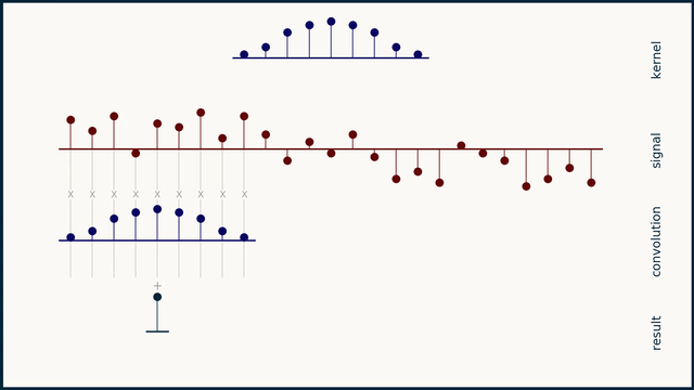
How does moving average work?
How does the Savitzky–Golay filter work?
